Pawsome's ARR Team
Recurring Revenue & Customer Health Analytics — rebuilding, from the data up, the system I used to operate through a vendor's UI. Proof I can build the tool, not just run it.
The Project Context
This project adds a professional data transformation layer on top of the existing Pawsome Provisions BI stack. While the domain is fictional, the data model, metrics, and tooling reflect real-world CS and RevOps workflows — because I built them to.
For two and a half years I was embedded with enterprise accounts as their technical point of contact, managing account health in ChurnZero and reconciling usage and billing data from Salesforce to support recurring reporting cycles and executive-ready status updates. Every one of those platforms had a ceiling — a UI showing me the output of a data model I never got to see, let alone build. This project is that rebuild, from memory: going past the UI into the underlying model, and proving I can deploy the system, not just operate someone else's version of it.
All data was simulated and intentionally designed to resemble a mid-market SaaS vendor rather than a food manufacturing facility. That's deliberate — customer success and SaaS revenue operations is the domain I know, and the domain I want to deploy into.
dbt Transformation Logic & Lineage
This was the toughest part of this project — and the part I'm most proud of. Here's the analogy that got me through the jargon.
Think of a restaurant. The plate on your table is the finished product. That dish lived in three other rooms before it reached you — and before that, it was just ingredients on a delivery truck. For Pawsome's ARR team, that delivery truck is the raw data.
- Layer 1 — Staging (The Prep Station) Ingredients are off the delivery truck. They get chopped, sorted, and cleaned. For Pawsome, the raw data got cleaned, consistently labelled, and loaded into DuckDB. Nothing fancy — just making sure everything is in order before the cooking starts.
-
Layer 2 — Intermediate (The Cooking Station)
Ingredients come together into something meaningful. Two dishes were cooked here:
1. Accounts enriched with users and subscriptions — so that for every account, we could see not just who they are, but how many users they have, how many are actually active, and what their subscription looks like. One complete picture per account.
2. Alerts enriched with account context — so that every alert carried information about what tier the account was, what region they were in, and whether they were active or churned. Without this, an alert is just an alert. With this, it's "a critical alert at an enterprise account in EMEA that's already showing churn signals." That's actionable. -
Layer 3 — Marts (The Pass)
The expeditor station — where dishes get plated and made presentable for the table. Pawsome has four:
1. dim_accounts — the master account list. Every account with everything we know about them in one place. Think of it as the customer file a CSM pulls up before a call.
2. fct_mrr_by_account — the revenue view. Which accounts are paying what, broken down by tier and region. What a RevOps leader looks at to understand where money is coming from and where it might leave.
3. fct_alert_summary — the operations view. How many alerts per account, how severe, how many are sitting unacknowledged. What a CS Engineer monitors to know which accounts need intervention before the customer even picks up the phone.
4. fct_account_health_score — the crown jewel. A single number per account that combines four signals into one answer: "how healthy is this relationship?"
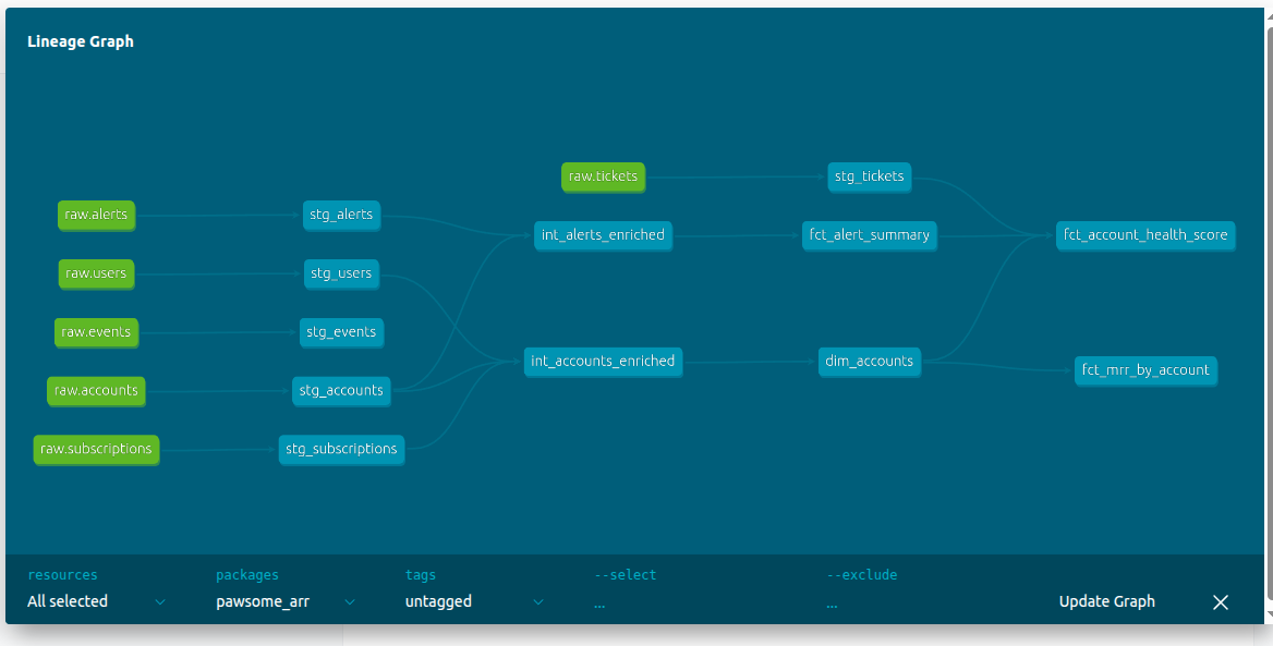
Lineage view: the full dependency graph showing how every model connects — from raw sources on the left to mart tables on the right.
Metabase Analytics Dashboards
Three dashboards were built on top of the dbt mart models using a Dockerized Metabase instance — powerful BI visualization without licensing fees. These are the kind of views I used to build by hand for executive QBRs — here, they're generated directly from the underlying data model instead of assembled slide by slide.
-
Dashboard 1 — Account Health Overview
- Scatter plot — health score vs ARR (bubble size = seat utilization)
- Bar chart — accounts by health score band (Critical / Low / Medium / Healthy)
- Table — bottom 10 active accounts by health score (churn risk watchlist)
-
Dashboard 2 — MRR & Revenue
- Total active MRR (number card)
- MRR breakdown by tier
- MRR by CSM region
- Active vs churned ARR
-
Dashboard 3 — Alert Operations
- Unacknowledged alerts count
- Resolution rate by tier
- Critical alerts by account (table)
- Alert volume by tier (stacked bar)
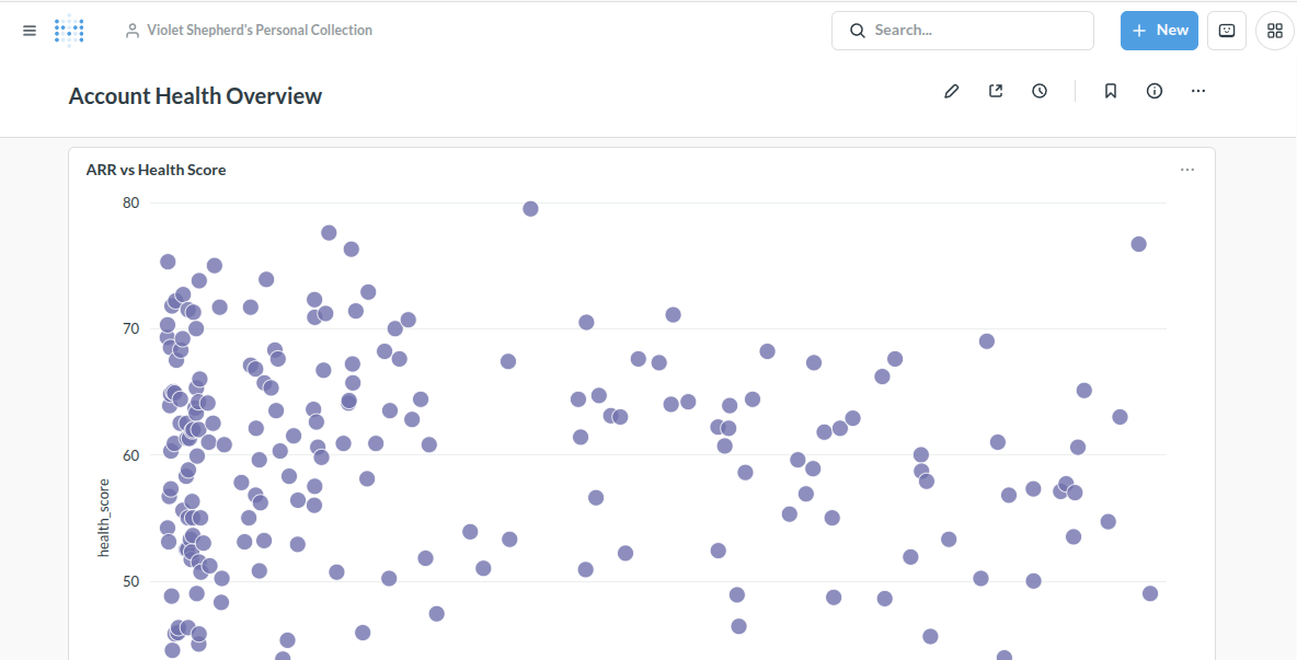
Dashboard 1: Account Health Overview — ARR vs health score scatter plot with churn risk table below.
From Dashboard to Decision: A Sample QBR
A dashboard is only useful if someone can act on it. Having sat in this exact conversation for two and a half years, I wanted to prove the underlying data model could actually support it — so I picked one account from the dataset and built the QBR I'd deliver from this system, not a vendor's.
Meadows Group stood out for the right reason: it's one of the largest accounts in the book by ARR, but one of the lowest-scoring on health. Digging into why surfaced a real, specific tension — usage had grown nearly 19x since onboarding, but satisfaction was being dragged down by billing and onboarding friction, and two high-severity security alerts had sat unacknowledged for months. That's the kind of account that actually needs a CSM in the room, not just a passing green checkmark.
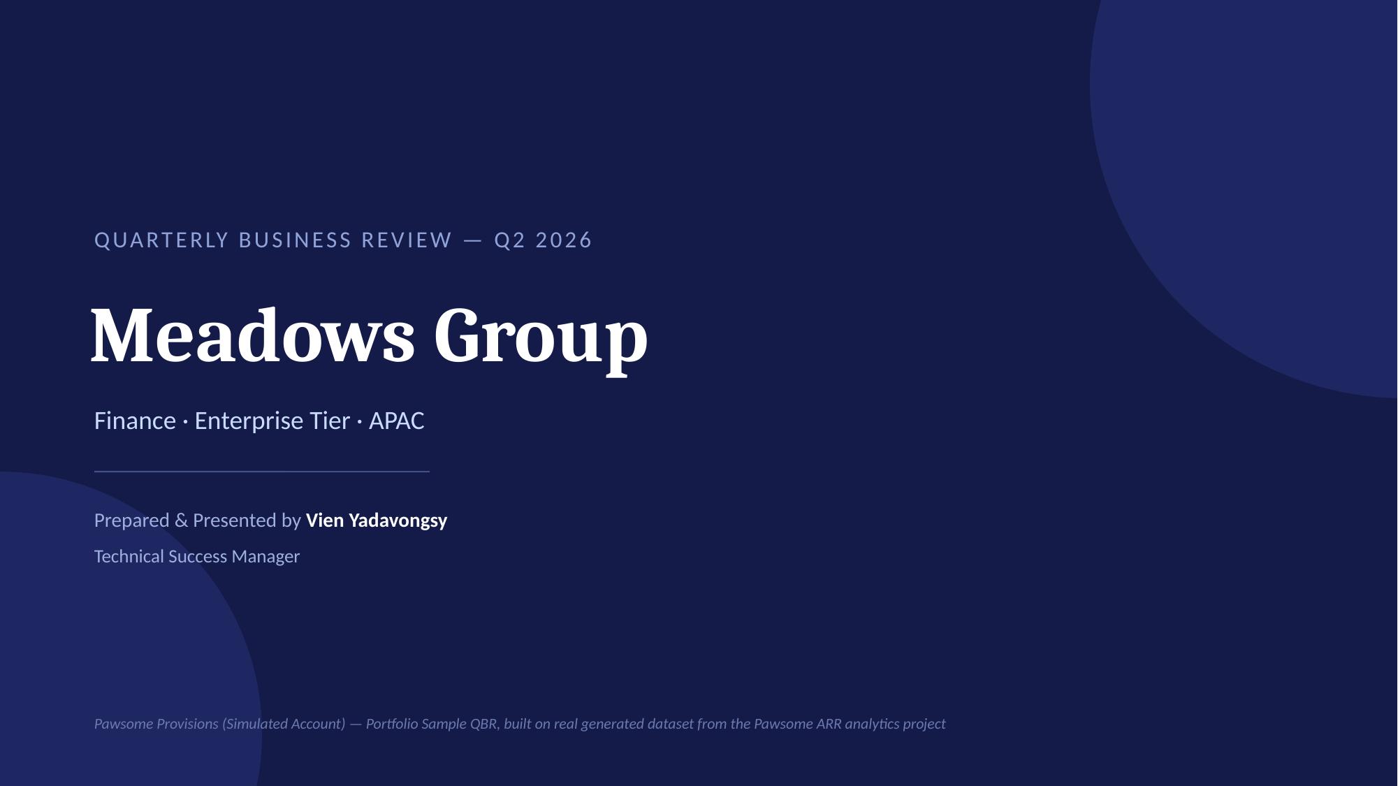
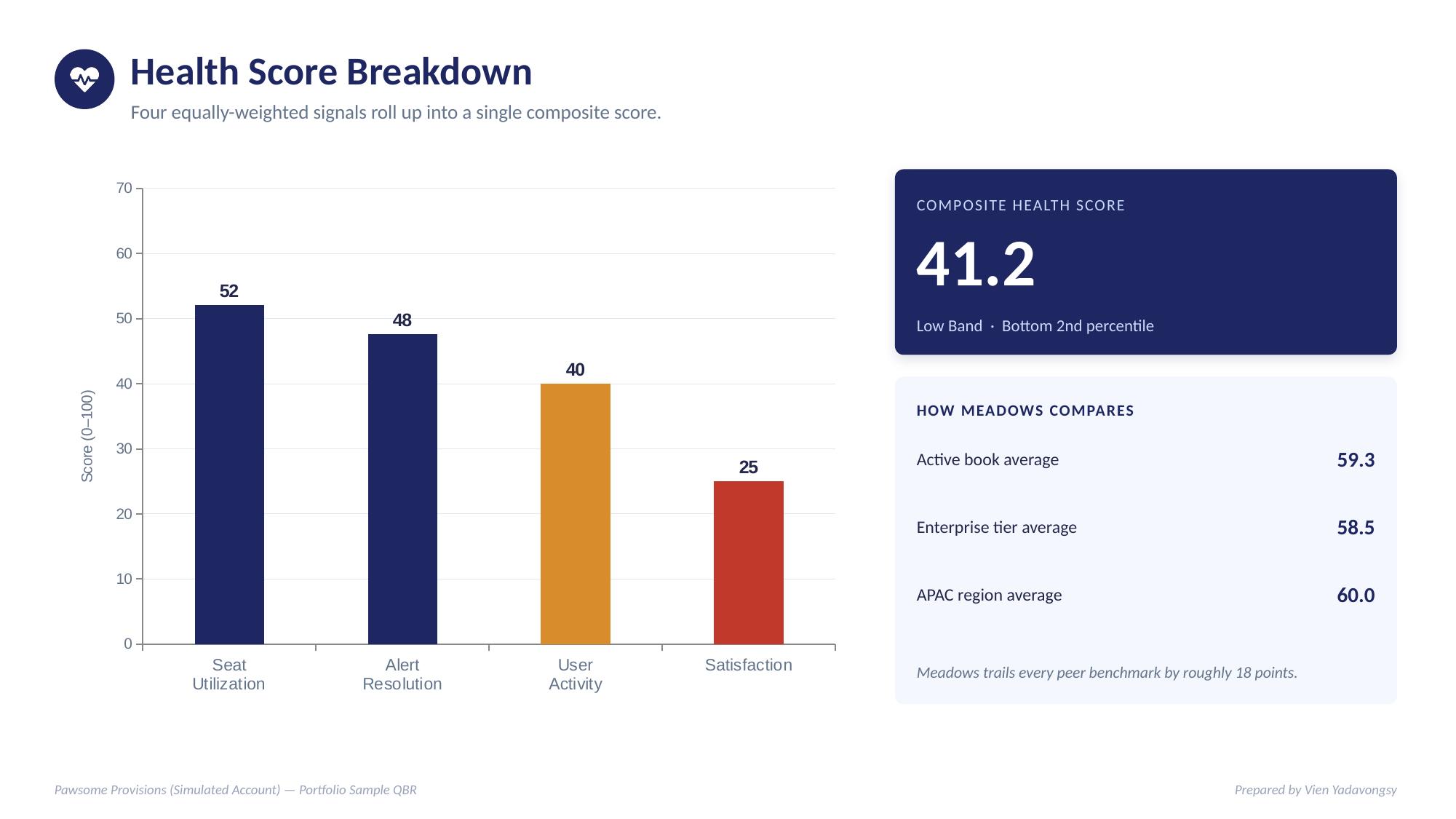
Meadows Group QBR (PDF)
Full 10-slide deck — account snapshot, health score breakdown, usage trends, support and security review, 90-day action plan, and renewal outlook.
View PDFMeadows Group QBR (Editable)
The same deck as an editable PowerPoint file, built with native charts and tables.
Download .pptxRunning the Project Locally
Prerequisites: Python 3.10+, dbt-duckdb (pip install dbt-duckdb), Docker and Docker Compose.
# Clone the repository
git clone https://github.com/vienyadavon/pawsome-arr
cd pawsome-arr
-
# Step 1 — Generate simulated data
cd data_generation python3 generate_accounts.py python3 generate_users.py python3 generate_subscriptions.py python3 generate_events.py python3 generate_alerts.py python3 generate_tickets.py -
# Step 2 — Load CSVs into DuckDB
python3 load_to_duckdb.py -
# Step 3 — Run dbt
cd .. dbt run dbt test -
# Step 4 — Start BI environment
cd bi docker compose up -d python3 load_marts_to_postgres.py -
# Step 5 — Open Metabase
http://localhost:3001
Project Assets & Dashboards
Outputs from dbt and Metabase. The dbt models used the DuckDB adapter before mart tables were loaded into PostgreSQL for Metabase to query.
dbt_project.yml
Project configuration — variable paths and model materialization settings.
View CodeDashboard 1 — Account Health
Health score distribution, ARR scatter plot, and churn risk watchlist.
View PDFDashboard 3 — Alert Operations
Unacknowledged alerts, resolution rates, critical alerts by account.
View PDFLineage — dim_accounts
The master account list. Think of it as the customer file a CSM pulls up before a call.
View FileLineage — fct_mrr_by_account
What a RevOps leader looks at to understand where money is coming from and where it might leave.
View FileLineage — fct_alert_summary
What a CS Engineer monitors to know which accounts need intervention before the customer picks up the phone.
View FileLineage — fct_account_health_score
A single score combining seat utilization, alert resolution, active user rate, and satisfaction — the four signals that correlate with a healthy customer relationship.
View FileA Note on AI Assistance
Claude (Anthropic) was used for architecture guidance, dbt project structure, code review, and pair programming throughout the transformation layer — staging models, intermediate models, marts, tests, and documentation. All design decisions, domain framing, debugging, and implementation are my own work.
Google Gemini was used to assist with the six simulated data generation scripts. Generating realistic randomised business data across multiple related tables required domain knowledge I leaned on AI to bridge — RevOps and SaaS metrics aren't my native language. The resulting scripts were reviewed, troubleshot, tested, and integrated by me.
Both tools were used as collaborative assistants, not replacements for engineering judgment.